I was able to get a sneak peek of the the much anticipated Atlanta Homes & Lifestyles Southeastern Showhouse, and it is truly amazing. Many of the most talented designers from the Southeast are represented, including some of my long time favorites - Suzanne Kasler, Bob Brown, Phoebe Howard, and Melanie Turner. Over 30 designers were involved, so the list is long! The doors open to the public on Saturday, April 23; tickets are $30 at the door, and the beneficiary is Safe Kids Georgia.
Here are some highlights from the house, although this barely scratches the surface - the house is 22,000 square feet plus a 2800 square foot guest house with a bedroom, living area, and full kitchen. The designed outdoor spaces encompass an additional 6500 square feet.
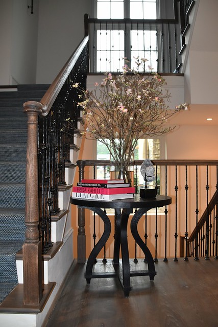
The two story entry with a double staircase, design by Melanie Turner.

The formal dining room was a favorite of mine. I knew the minute I saw it that Suzanne Kasler was the designer! Note the walls and ceiling - they were done in a high gloss lacquer treatment that took 72 hours to dry.
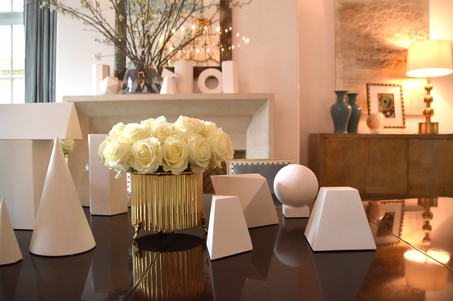
The plaster architectural forms on the dining room table and mantel were purchased at a small store in Paris.
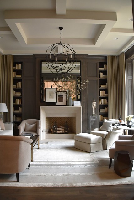
The study by Robert Brown was one of my favorite spaces. I love the layering of the art on the mantel.

Three sides of this room are floor to ceiling bookcases.

Upon closer inspection, it looks like all of the books in the room are placed with the leaves facing out, giving a uniform but varied look to the room.
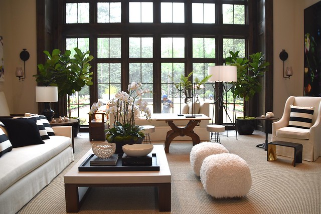
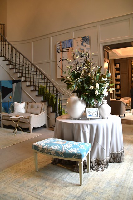
The Great Room is a central space in the house, and was designed by Barbara Westbrook. The expanse of the space was difficult to capture on a camera - it has to see seen in person to appreciate it!

The second floor balcony gives a different perspective on the space. To the left of this space is the kitchen, which was such a hub of activity that I did not get a picture!
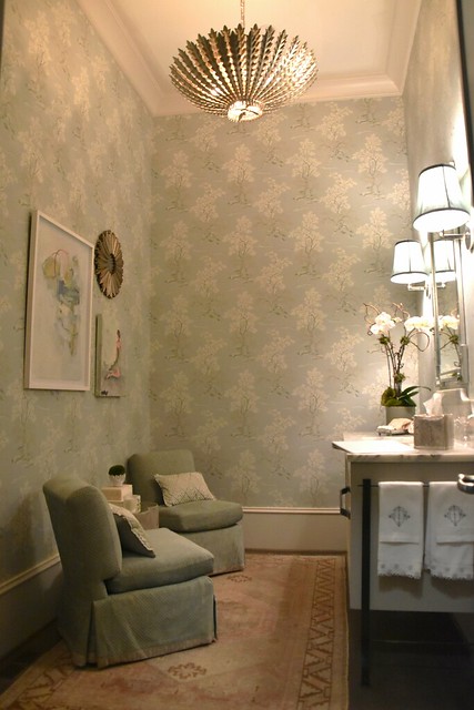
A beautiful formal powder room was difficult to photograph, and this picture doesn't do it justice! It was such a welcoming, cozy space.
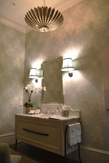
A view of the custom sink. Note the clever built in iron attachment for the hand towels. Design by Cam Reynolds and Jenny Taubel of Gramercy Home.

The master bedroom by Phoebe Howard was also breathtaking. It was impossible to capture the volume of the space in a picture (the room is double height - the ceilings must have been at least 20 feet), so instead this vignette will have to give a feel for the style of the room.

A wonderful art arrangement in the master sitting room, by Amy Morris. This space is the future closet of the master bedroom; the builder is going to customize the closet for the future owner of the house. Note the custom ceiling treatment. All of the lights and lamps were on in the house, which was welcoming but made photography a bit tricky!
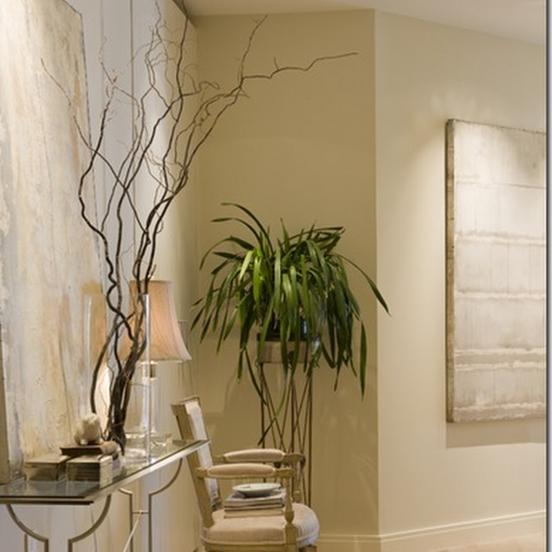
The back stairs had a lovely transitional area, and this vignette by Melanie Millner caught my eye.
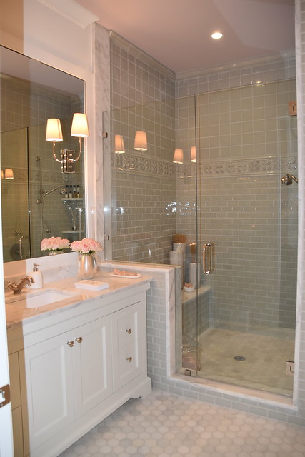
Although this wasn't a designer space, I think it is interesting to see what finishes are being selected for secondary bathrooms in a speculative house. This bathroom was beautiful - on the right is second sink. Simple hexagon tile with gray grout on the floor, and a mix of subway tile and square tiles on the shower wall in a soft green/gray.
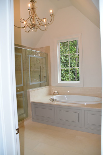
Another secondary bathroom with both a built in tub and a shower with an interesting etched design on the glass. I like the cream and gray tones used together.

This quiet transition space by Brian Watford was beautiful. The walls look like they are treated with fabric and nailhead trim. I would love to go back and check!
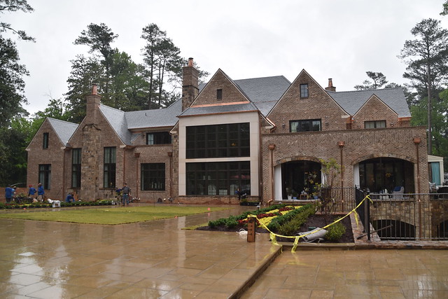
It was a rainy morning, and the landscape crew was working full force to get everything installed by opening day on Saturday.
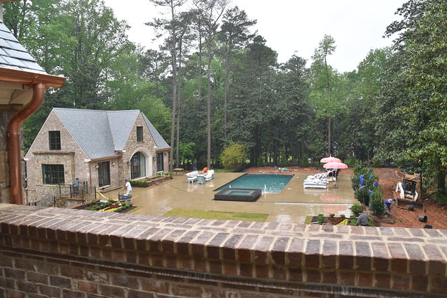
A view of the pool and 2800 square foot guest house. My pictures of the spaces in the guest house did not turn out well, so you will need to visit for yourself to see the rooms in person!
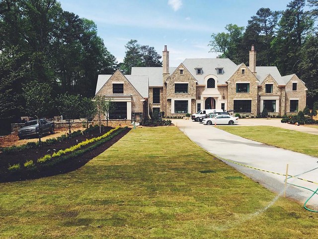
It was too crazy and rainy to get a picture of the front of the house today, so I am using this one from the @southeasternshowhouse Instagram account. Check it out, there are many beautiful pictures.
Based on this sneak peek, do you have a favorite room? Looking at the Instagram account, I realized that I did not even see some of the upstairs bedrooms (and I did not show the ones I saw in this post). There is so much to see! All of the spaces were so beautifully designed and had such unique and interesting ideas. I highly recommend visiting the house for some incredible inspiration!
To comment on this post, please click here.
*
For information on the AH&L Southeastern Showhouse, please visit
http://www.southeasternshowhouse.com/

APRIL 23 - MAY 15, 2016
3800 NORTHSIDE DRIVE, ATLANTA, GEORGIA 30305
HOURS + PARKING
APRIL 23 - MAY 15, 2016
Thursdays - Saturdays, 10:00am - 4:00pm
Sundays, 1:00 - 4:00pm
Closed Mondays, Tuesdays, and Wednesdays
Sundays, 1:00 - 4:00pm
Closed Mondays, Tuesdays, and Wednesdays
NO PARKING is allowed on Northside Drive.
Please park at 500 Fairfield Rd., Atlanta, 30327, and follow the signs to park along the Top Hat Soccer Field side of the road and proceed to designated shuttle loading zone. Attendants will be positioned at each point to assist you.
To comment on this post, please click here.
Please park at 500 Fairfield Rd., Atlanta, 30327, and follow the signs to park along the Top Hat Soccer Field side of the road and proceed to designated shuttle loading zone. Attendants will be positioned at each point to assist you.
To comment on this post, please click here.
To see my latest blog post, click here.
To subscribe to my blog by email, click here.
To follow my blog on Facebook, click here.
Twitter: @TTIBlog
Instagram: http://instagram.com/ttiblog
Pinterest: http://pinterest.com/ttiblog/
To subscribe to my blog by email, click here.
To follow my blog on Facebook, click here.
Twitter: @TTIBlog
Instagram: http://instagram.com/ttiblog
Pinterest: http://pinterest.com/ttiblog/